HelloFresh Usability Testing
A project aimed at identifying UX challenges and providing tailored recommendations to enhance the experience, with a specific focus on first-time users.
Skills
Heuristic Evaluation
Competitive Analysis
Moderated User Testing
SUS Analysis
Team
Anushka Pimplikar
Jessica Weng
Rudra Barad
Tanuja Reddy
Xiao Yu
Background

What?
HelloFresh is a leading meal kit service that delivers pre-portioned ingredients and chef-curated recipes to customers, making home cooking convenient, enjoyable, and accessible.
Why?
As HelloFresh continues to expand its reach and refine its services, understanding and optimizing the user experience of its mobile application for new users and potential subscribers becomes a critical objective.

Research Goals & Objectives
Goal
The overarching goal of this study is to understand the pain-points of users, with a specific focus on improving usability for new users and potential subscribers.
Objectives
Conduct assessments to pinpoint specific usability problems in the HelloFresh mobile app for new users and potential subscribers.
Examine user feedback to determine the features within the HelloFresh app that users appreciate the most.
Provide actionable suggestions to enhance the HelloFresh mobile app by addressing usability issues and optimizing favored features for an improved user experience.
The Process

Heuristic Evaluation
We applied Jakob Nielsen's design principles to conduct a heuristic evaluation of the flows that were most crucial for new users. We utilized a severity scale ranging from 0 to 4.
Below is the top-level assessment of the initial user flow. The complete report is available here.


Competitive Analysis
We performed a competitive analysis to identify the players in the online meal-kit/meal delivery market. Our aim was to assess the strengths and weaknesses of each of these competitors when compared to HelloFresh. This allowed us to gain insights into both successful practices and areas for potential improvement.

We conducted the analysis for two distinct categories of competitors:
Direct Competitors: These include BlueApron, Sunbasket, and Gobble.
Indirect Competitors: This category encompasses UberEats, Lalamove, and MyFitnessPal.
Direct Competitors
No Sign-In Exploration: Allowing users to explore the app without immediate sign-in can help attract and retain users who want to assess the app before fully committing.
Detailed Meal Plans: Offering transparent instructions for setting up meal plans, including considerations like price and serving size for each day, can improve the user experience.
Indirect Competitors
Design Opportunities
Provide a concise and explicit description of the app's functionalities for new users to easily grasp its purpose.
Allow users to explore the app's content without requiring them to log in. This way, they can evaluate its relevance and decide whether to proceed with using it.
Improve the recipe process by incorporating visual aids such as images and videos to guide users through the cooking process effectively.
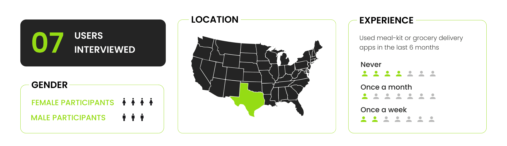
Recruiting Participants
In our study, we developed a screener to identify individuals experienced with meal delivery services (excluding HelloFresh), traditional grocery shopping, or meal kit delivery apps. We engaged with students and young professionals across different job sectors to participate in our research.
Testing Methodology

What We Measured
During our testing, we assessed 6 task flows and diligently recorded observations and user feedback. Participants were encouraged to think out loud, allowing us to gain insights into their thought processes. We tracked the time required for successful task completion, documenting both successes and failures.
The path taken by the User
User’s Comments (Think Aloud)
Preferences and Frustrations
Overall Performance
Qualitative
Time on Task
Usability Score
Success Rate
Number of Attempts
SUS Score
Quantitative
Testing
We thoroughly examined 6 particular tasks to gauge their usability and performance. These tasks were thoughtfully selected to encompass a variety of user interactions within the application:
Skipping Sign Up and Log In
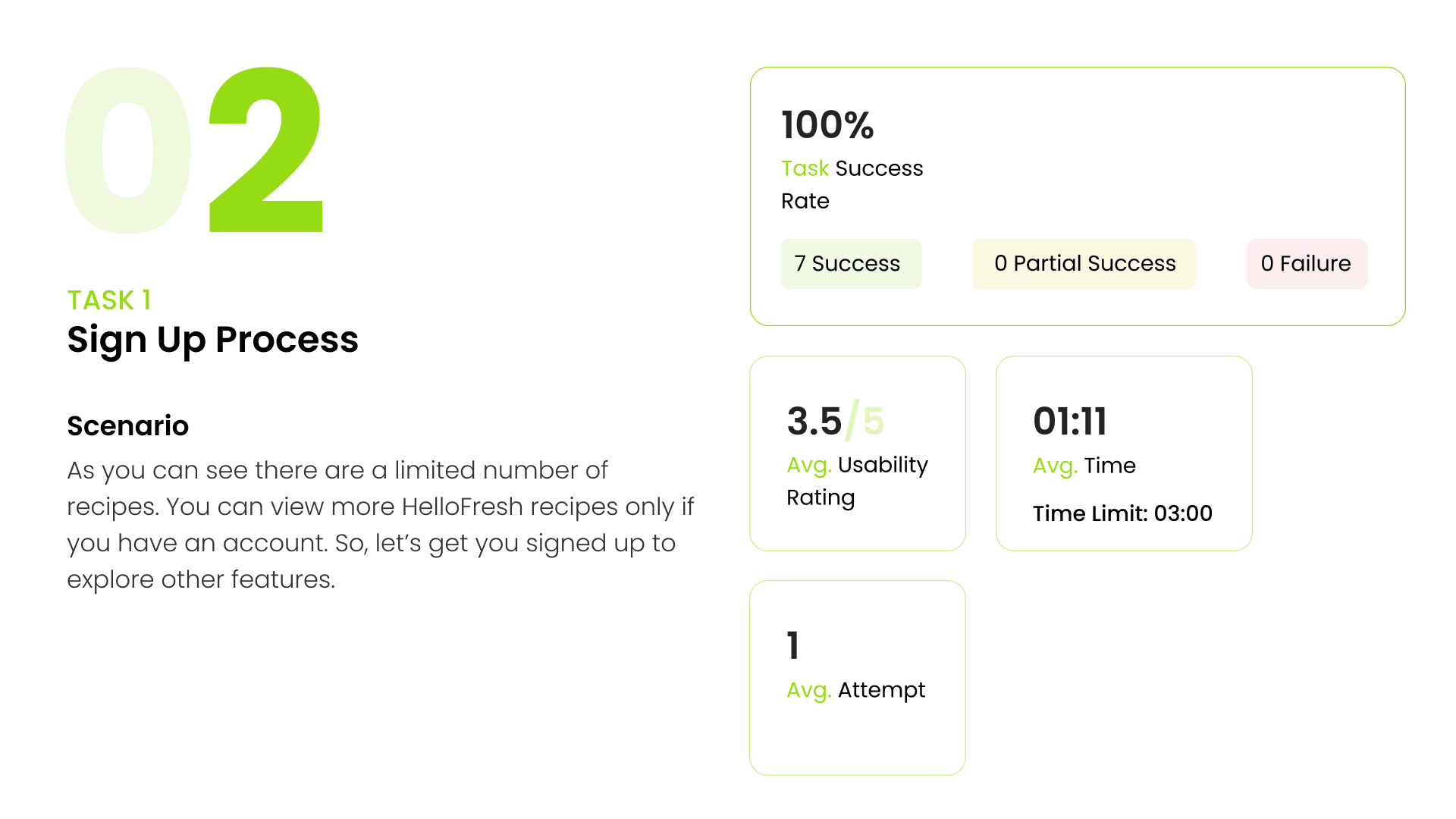
Sign Up Process
Searching for a specific recipe
Adding recipes to favorites and accessing favorite recipes
Building your meal plan
Accessing chat support
In the section, we'll delve deeper into the details of each task.
Task 1

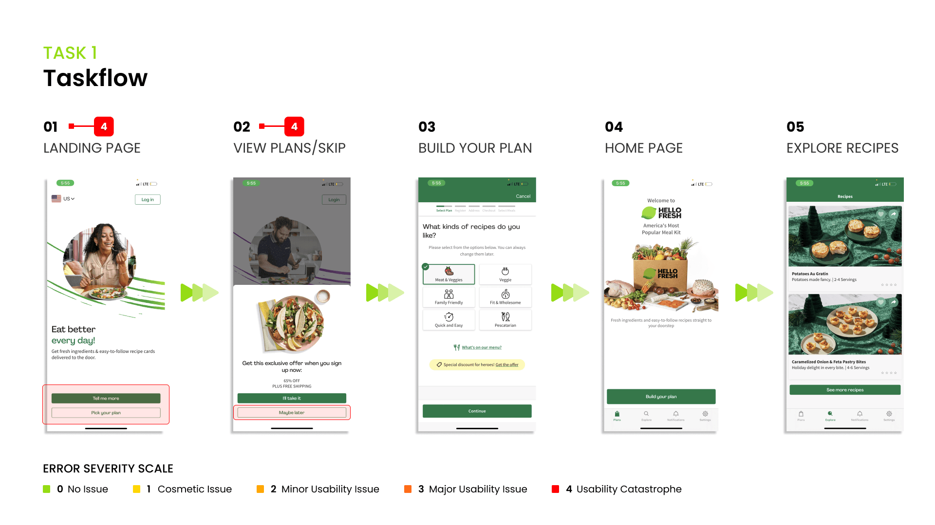
“Why is it asking me to build a plan even if I clicked on ‘Maybe later’? I want to see the options first.”
Observations
The 'Maybe later' button currently redirects the user to the same page as 'Build your plan.' Users are prone to abandon the process when compelled to create a plan or sign up without the option to browse first.
Design Recommendations
Include a "Skip" button on the initial page to grant users the option to browse for recipes, rather than mandating them to start building a plan immediately.
Implement a clear and user-friendly onboarding process specifically tailored for first-time users.

Task 2
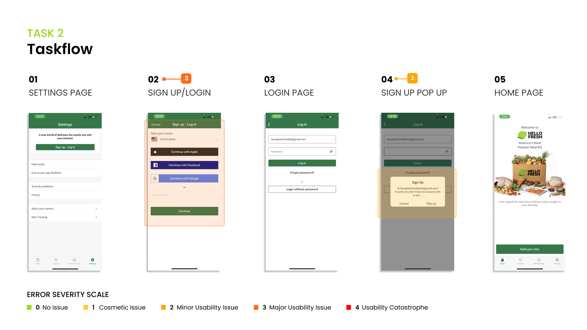
“Where should I start to sign up? Is this input box and continue button for sign up or log in?”
Observations
There is a lack of distinct sections for the sign-up and login processes, particularly when the user opts to sign up using their email rather than Google or Facebook.
The "Continue" button's functionality is ambiguous and may create confusion for users.
Design Recommendations
To enhance error prevention and user clarity, consider implementing two separate sections or options for sign-up and login processes.
Provide clear and informative labeling for the "Continue" button to eliminate any ambiguity and guide users effectively through the sign-up or login process.

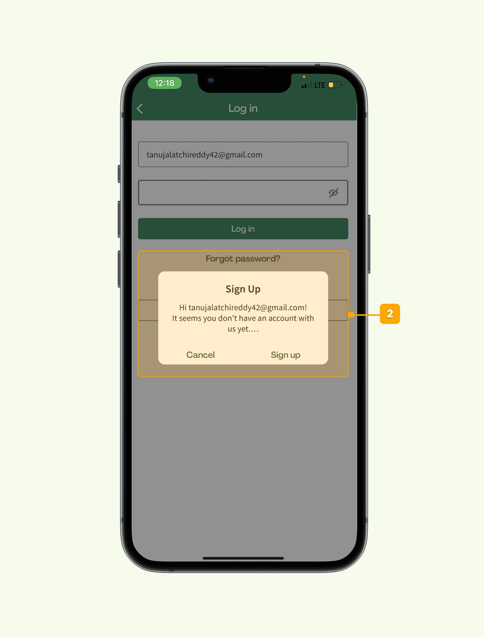
“It’s confusing. I’m not sure if I created an account successfully.”
Observations
Users anticipate receiving feedback when they have successfully created an account.
Design Recommendations
Implement a pop-up notification to clearly indicate the successful creation of an account, ensuring users receive immediate feedback.
Task 3


“I don’t notice there is a filter icon!”
Observations
Users frequently overlooked the filter icon and instead resorted to using the search bar for recipe searches.
Design Recommendations
Opt for a more recognizable filter icon or complement the icon with a label, such as "Filter," placed nearby to enhance user awareness and usability.

“I can’t control this roller to the exact number.”
Observations
Users encountered difficulties in precisely controlling the slider to reach their desired values.
Design Recommendations
Enhance the user experience by permitting users to directly input the exact numerical values in the filter page, providing greater control and accuracy.
Task 4


Observations
Users had difficulty noticing the heart icon due to its low visibility, and they expected to find a save button on the recipe page.
Design Recommendations
Enhance the visibility of the heart icon by increasing its opacity for improved user recognition.
Additionally, consider incorporating a clear and conspicuous "Save" button on the recipe page to meet user expectations.

“I thought it’s a wallet thing!.”
Observations
Users struggle to associate the term "cookbook" with saved recipes, and the icon representing the cookbook is unclear to users.
Design Recommendations
Replace the term "My cookbook" with something more intuitive, like "My Favorite Recipes" or "Saved Recipes."
Utilize a more easily recognizable icon for the cookbook or saved recipes to enhance user understanding.

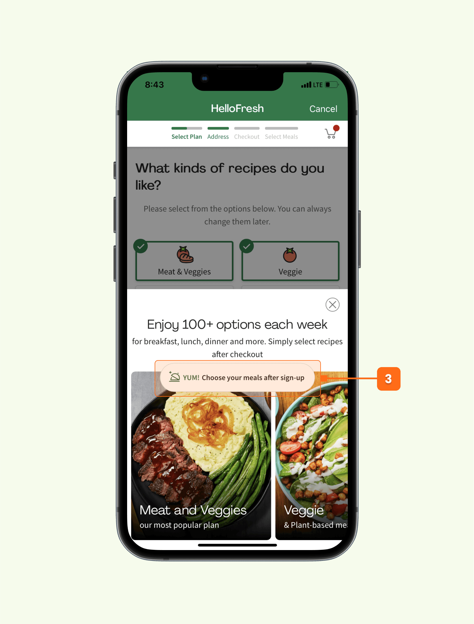
Task 5
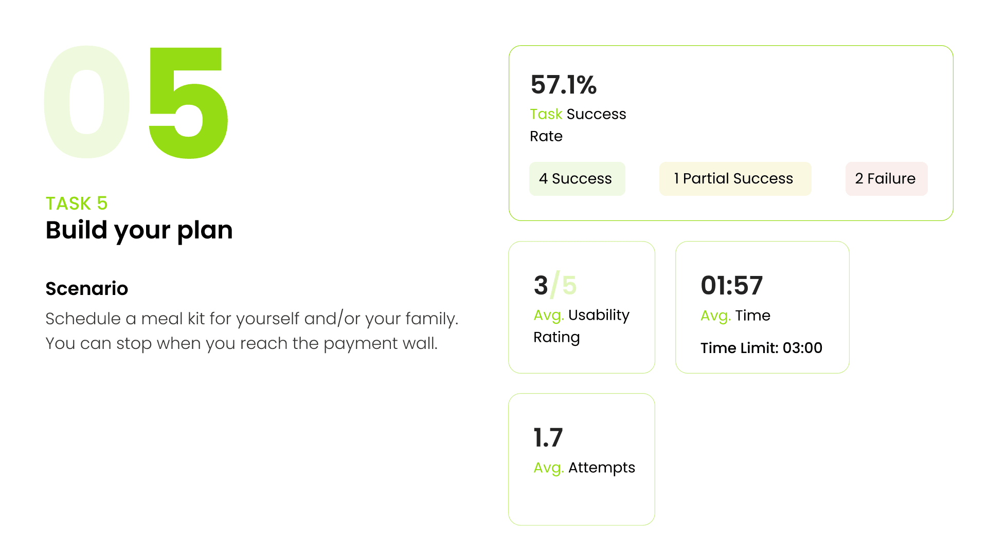

“I don’t know what I have ordered. It should just pop up some hints for me to see what’s going on.”
Observations
Users have a strong preference for understanding what they are ordering before making a payment.
Even when users click the "What's on our menu" button, they are unable to preview the contents of their order.
Design Recommendations
Empower users with the ability to preview the recipes included in their selected plan, granting them the freedom to see what they are ordering before proceeding with the payment.

“Why I can’t see what’s on the menu? I have signed up, right?”
Observations
The term "sign up" can be misleading as users have already registered by creating an account.
Additionally, after tapping on a category, users still face difficulty in viewing the menu.
Design Recommendations
Building upon the earlier recommendation, allow users the flexibility to individually select their preferred recipes or orders.
Consider replacing the "sign up" terminology with a more suitable phrase, given that users are already registered.
“I want to know what I am paying for before agreeing to place the order. I also want to know if there are any allergens in the meals.“
Observations
Despite completing the task prior to payment, users hesitated to make payments due to uncertainty about their order's contents.
Users expressed the desire to view estimated prices for different plans before finalizing their orders.
Design Recommendations
Create an "Order Summary" section that allows users to review a detailed summary of their order, ensuring clarity about what they are ordering.
Enable users to view estimated prices for various plans, offering transparency in the ordering process.
Offer the option for users to include any comments or provide special instructions related to their order.

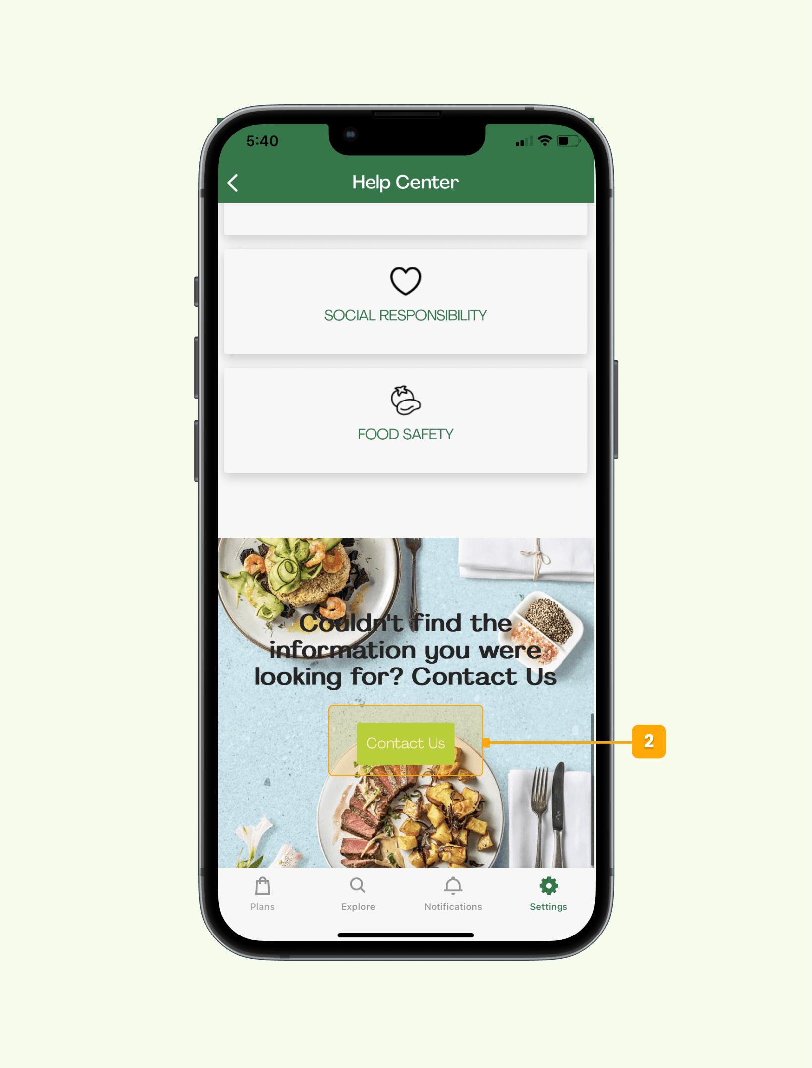
Task 6
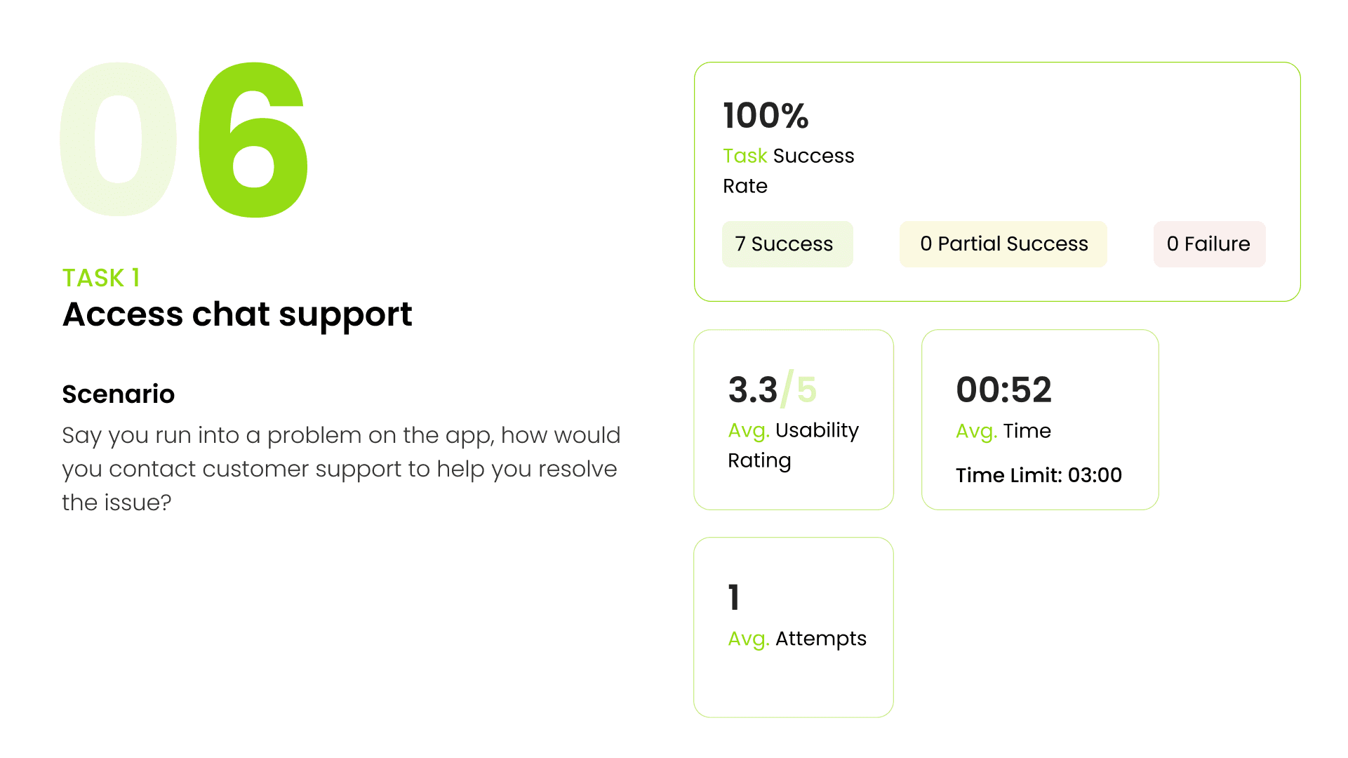
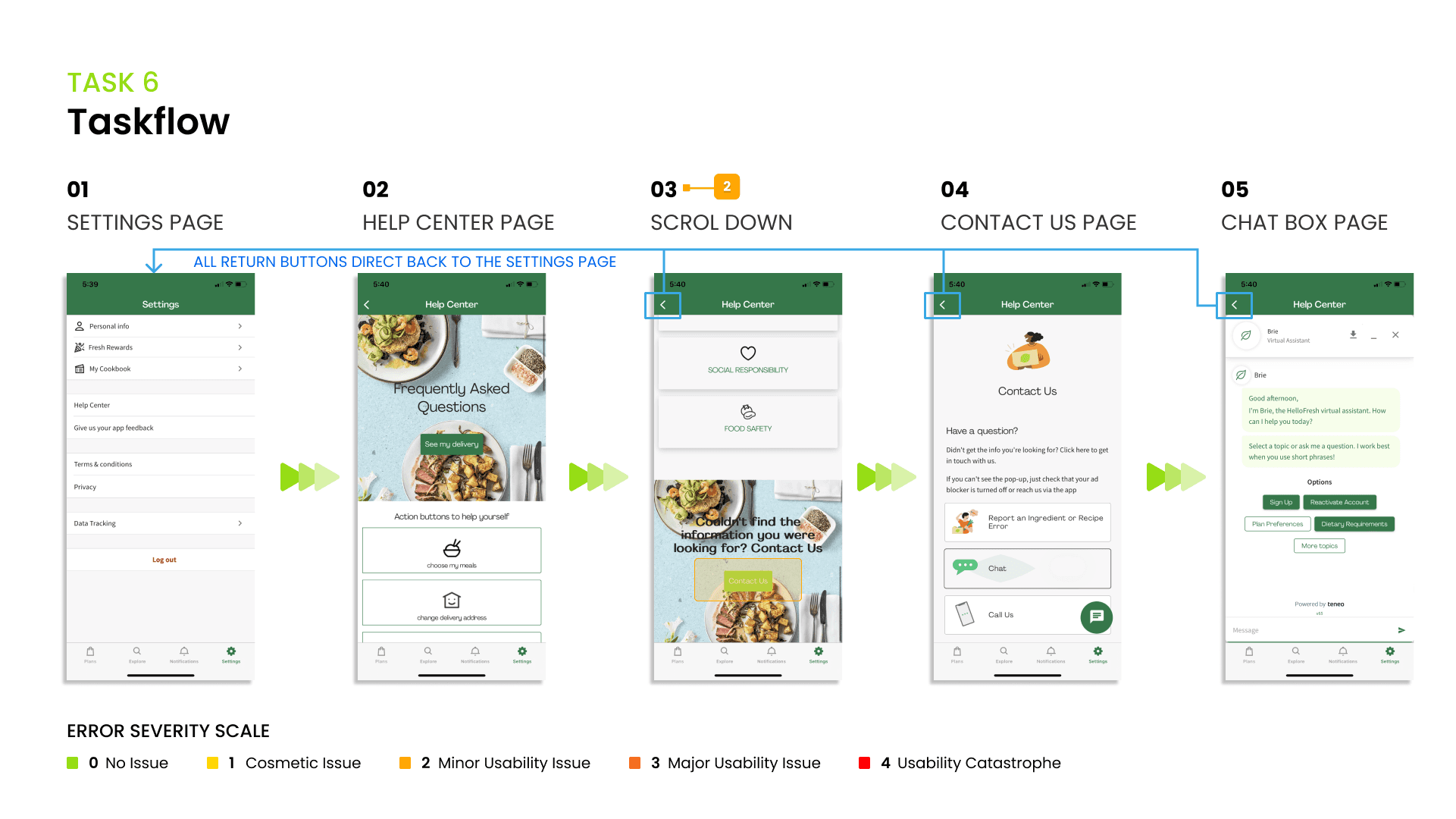
“I don’t really like this because I need to go really really down.”
Observations
Users encountered difficulty locating the button, considering it buried deep within the app.
The use of light green for the "Contact Us" button presented readability challenges and confused users, as it deviated from the color scheme used for other buttons.
Design Recommendations
Enhance user accessibility by relocating the "Contact Us" option to a more prominent position, such as placing it at the top of the "Help Center" page or making it accessible through the "Settings" section.
Standardize the button's appearance to maintain visual consistency throughout the app, ensuring a cohesive user experience.
Results and Analysis
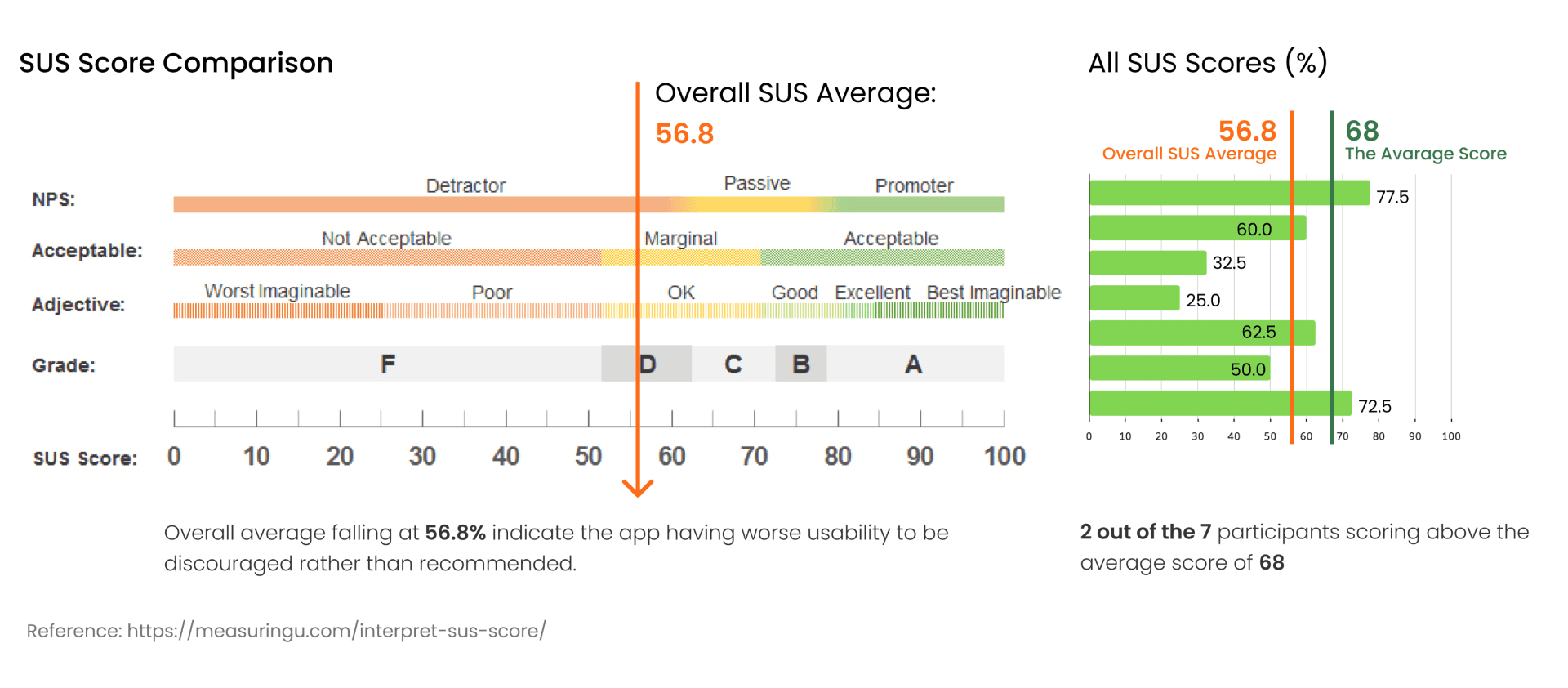
SUS Analysis
We employed the System Usability Scale (SUS) to gauge the perceived usability of this application by its users. The SUS scores were then transformed into percentile ranks and compared against other versions or variations for evaluation.
Post-Task Questionnaires Analysis
We developed four post-questionnaires to gain insights into the participants' overall experience and gather feedback for review and improvement. These questionnaires cover topics such as Overall Impression, Favorite Features, and Suggestions for Enhanced Usability.

The combined findings from the SUS analysis and the post-task questionnaire have revealed that the app's usability is below average, indicating a substantial need for improvement. Interestingly, the variations in scores can be attributed to the enthusiasm expressed by users towards the recipes rather than the app's intrinsic usability. These observations underscore the importance of prioritizing enhancements to the app's usability and overall experience.
Key Insights & Recommendations
Usability and User Guidance
The app lacks user-friendliness for first-time users. We suggest providing a beginner's guide for
new users and including clear descriptions throughout the meal planning and ordering process.
User Flow & Navigation
User flow is often unexpected and user paths are unclear, causing confusion (e.g., the return button's behavior). Our recommendations include configuring the return button to direct users back to the previous page, implementing error notifications for incomplete order requirements, and using clear buttons on the sign-up and log-in pages to indicate the account status.
Difficulty in locating saved recipes due to unintuitive labeling ("My Cookbook"). We recommend prioritizing features before altering main app pages and adding a "Cookbook" or "Saved Recipes" section to the navigation bar as one of the main pages.
Transparency & Consistency
Users expect to review items and pricing before making a payment; lack of transparency can lead to user anxiety. Our recommendations are to allow users to review meal kits and select specific recipes within the meal-kit plan before reaching the payment stage, and to display estimated prices for different ordering plans. Additionally, we suggest maintaining design consistency by using the same color hierarchy (e.g., dark green) for buttons, ensuring a better visual experience.
Learnings
First-time Interview Experience: Conducting interviews with participants for the first time provided me with invaluable insights and a deeper understanding of user testing and research methodologies.
Version Compatibility Awareness: One big lesson from this experience was understanding how critical it is to keep tabs on app updates. The app's version can change everything in testing. It taught me the value of staying familiar with the app and ensuring you've got the right version before conducting tests. This kind of preparation is the key to getting accurate results and avoiding any hiccups caused by version differences.
Thorough Preparation: This whole experience really drove home the value of being meticulous in preparation. Staying in the loop with the app's latest version and features is key. It's what ensures we're presenting the most accurate picture possible during testing – a snapshot of the app in its current state.